Which color for which form? The results.
To know more about the form-color-study
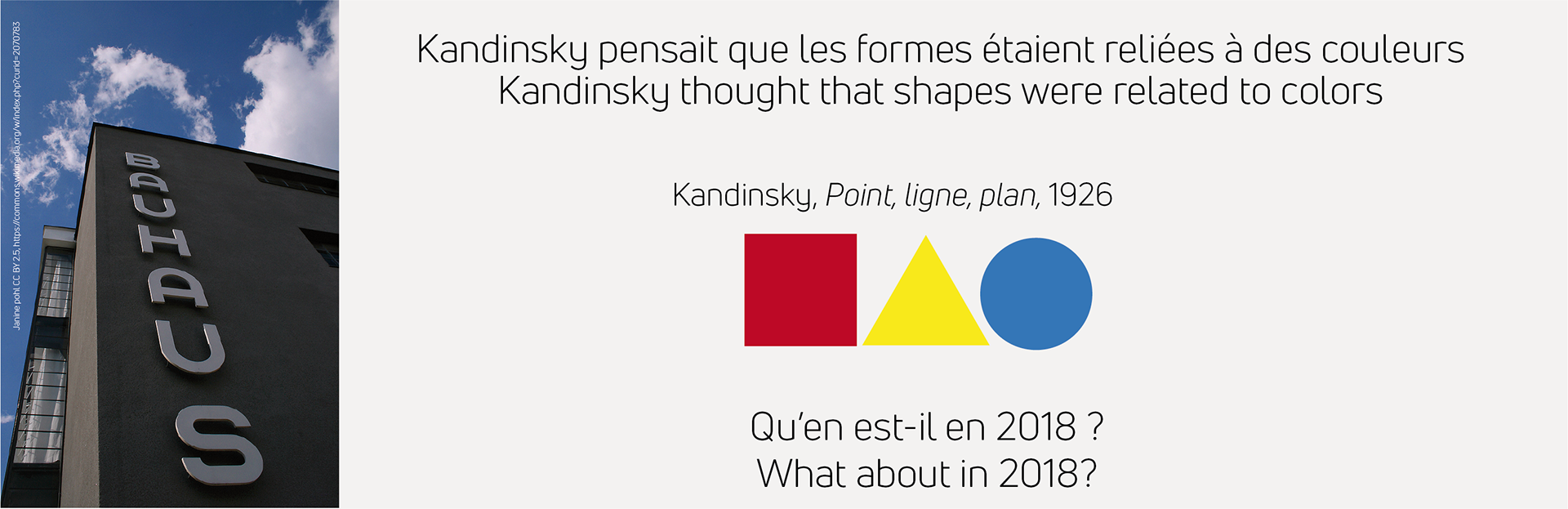
In his book 'Point and Line To Plane' (1926), Kandinsky presents the results of a study concerned with a possible correlation between the three basic geometric forms and the three primary colors.
The participants (professors and students of the 'Bauhaus') filled out a questionnaire, in which they were asked to connect the circle, the square and the triangle to the color which in their opinion is able to strengthen the quality of each of the three forms.
The circle was associated to the color blue, the square to red and the triangle to yellow.
Today, we would like to present you a study to you which is less ambitious but more spontaneous. The question was 'Which color do you intuitively associate to a circle?'
We would like to know if the results of Kandinsky's study are still applicable today.
Of course, this is of evident interest for our work, as we are graphic designers. Understanding which color a circle is naturally associated with, can help us to strengthen the inherent qualities of a circle. Thus, this can reinforce a universe, a visual impact and / or a semiotic interpretation.
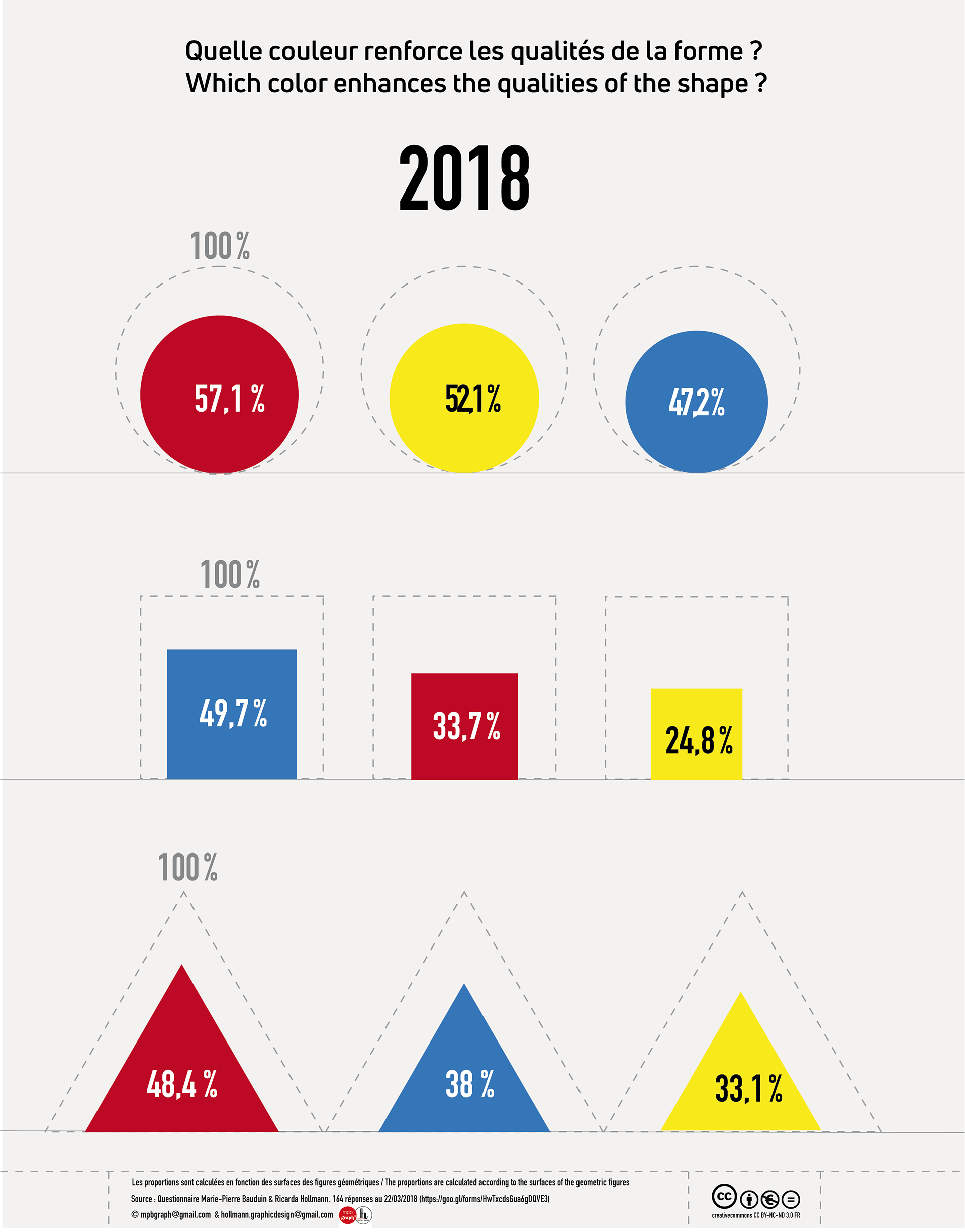
With 164 answers from our professional network, friends & social networks, these are our results:
The circle is mostly interpreted as red (57,1%) then yellow (52,1%), then blue (47,2%).
The square is associated most frequently with blue (49,7%), then red (33,7%), then yellow (24,8%).
And the triangle is commonly perceived as red (48,4%), then blue (38%), then yellow (33,1%).
The attached graph explains these results visually.
Our assumptions regarding the correlation between form and color are the following:
The preference for the red circle is probably the result of the Japanese flag, the yellow circle might be linked the sun. Triangles are presumably red because it is a dynamic color, just like the form of the triangle.
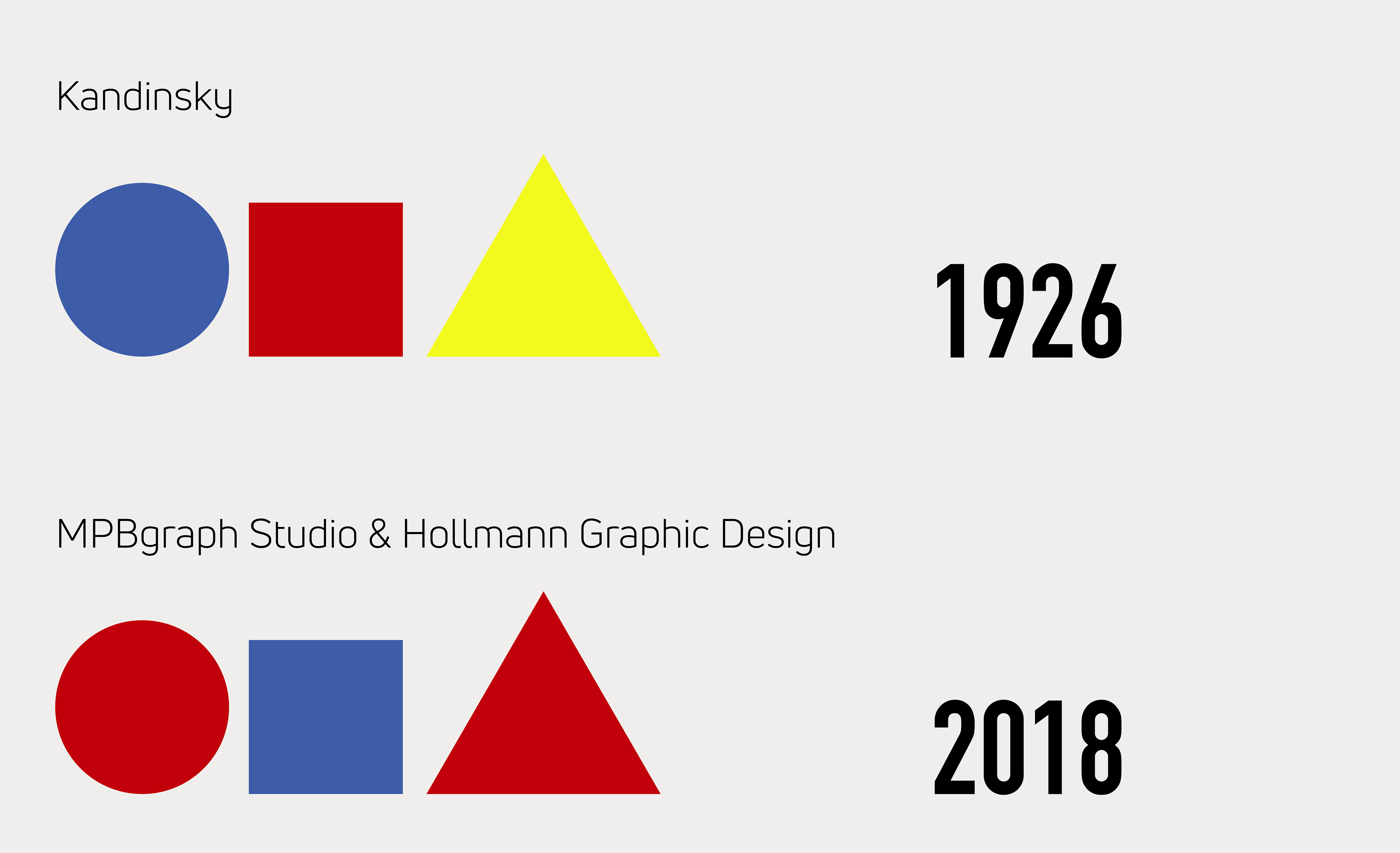
All in all, Kandinsky showed the following form-color-correlations: blue circle, red square, yellow triangle whereas we found the following results: red circle, blue square, red triangle.
So, even though one needs to consider the different conditions of the two studies, Kandinsky's results could not be replicated today.
Moreover, our results show that the color yellow is the least chosen color and that the circle the most chosen form. Is this the case because yellow is the least appreciated color in the West & the circle the most appreciated form?
For our future design work we will therefore consider these results, in order to create a semiotically more precious graphic design.
Thank you for your interest in our study!
Studio MPBgraph & Hollmann Graphic Design
References:
https://www.facebook.com/notes/t%C3%AAko-kangni/la-couleur-selon-kandisky-1866-1944/10151594255743767/
http://mediation.centrepompidou.fr/education/ressources/ENS-Kandinsky-jaune-rouge-bleu/ENS-Kandinsky-jaune-rouge-bleu-part2.html
Link to the study: